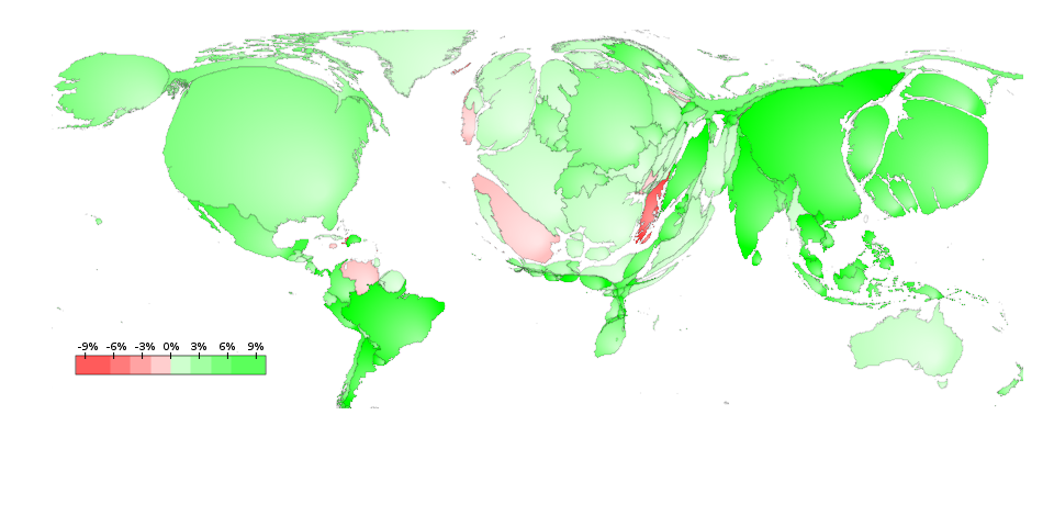
I have always found good visualization of data very important. A nice way to represent data related to maps is to use cartograms. Where a normal map allows you to color each country/state with a color representing your data, a cartogram allows you to convey much more information. In a cartogram, just as for a map, you also color each region to represent data, but on top of that, you inflate/deflate the size of each region to represent some more data.
In the example on the bottom of this post, each US state is colored green/red depending on its population growth. The states are inflated to represent the total population living in the state (I used recent data from Wikipedia). The other tab has the same example but for the European countries.
With the tool at the bottom of this post you can create your own maps and cartograms. Choose a color for each state/country and pick the size to which each country needs to be rescaled, click the Create Map button and your cartogram will be made.
Usually it is best to choose an intensive property to determine the color. An intensive property is data that does not depend on the size. Population growth is an example of such data. Population growth can be 1% no matter whether we are talking about a country with a large population or a small country.
On the other hand, the size is best determined by an extensive property, a property that does depend on the size. Examples are population, area, gdp, debt, ... The tool comes with some presets for the extensive properties. If you choose area as extensive variable the size of each country will be its actual area (and you will thus get a normal map that is not inflated).
To represent data as a color, I find it useful to divide the data into bins. Each bins then gets a discrete color. The color scheme used in the example pictures below are: from 00ff00 for full green, over 77ff77, bbffbb, to ddffdd for transparent/white green. For red the same idea applies: from ff0000, over ff7777, ffbbbb, to ffdddd.
If you are interested in more elaborate cartograms (e.g. the entire world), you are always welcome to contact me (leave a comment and I will get back to you). If you can provide me with an xml file in this format. The size is the inflation/deflation factor, the color tag encodes the rgba-color as a decimal. The rowname should correspond to the shapefile data from the map. I got all the shapefile map data on the wonderful website of Natural Earth.
Happy mapping!